Olivia
Aug 16, 2024
The Psychology Behind Color Choices in UX
Discover how thoughtful color choices can enhance user experience and evoke the right emotions.
Introduction: The Power of Color in Design
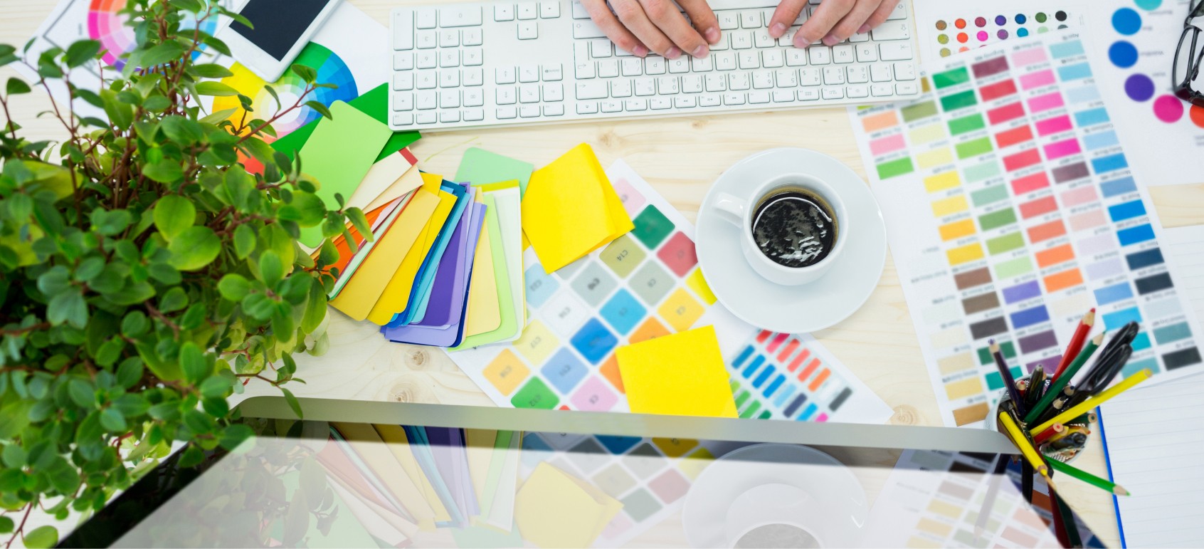
Color is a powerful tool in UX design, influencing user emotions, perceptions, and decisions. By understanding the psychology of colors, designers can create interfaces that not only look appealing but also communicate effectively.
Using Color to Guide Users
Colors can draw attention, signify actions, and create hierarchy. For instance, using bold colors for call-to-action buttons ensures they stand out, while muted tones can recede into the background. Additionally, colors can evoke emotions—blue for trust, green for growth, and red for urgency—aligning the interface with your brand message.
Balancing Aesthetics and Functionality
While colors should resonate with your audience, they must also ensure accessibility. Testing for contrast ratios and avoiding overuse of bright colors prevents visual fatigue. A balanced color palette ties the design together, creating a harmonious experience.
Conclusion
Thoughtful color choices enhance usability and emotional connection. By leveraging color psychology and prioritizing accessibility, you can create designs that resonate deeply with your users.


